GENERAL ELECTION VOTING INTERFACE
Helping Californians vote from the comfort of home.

We aimed to develop an online voting interface that enhances the accessibility of the democratic process. Through a visual design akin to the traditional ballot, and simplifcation of the voting flwo, the interface aims to mitigate barriers in accessibility and readability, ensuring that every citizen can effortlessly and confidently participate in the voting experience.
| ROLE | TEAM | TIME |
|---|---|---|
| UI Design/Testing | Ryan Baralt Asli Kocak Fa Taepaisitphongse |
4 Weeks |
RESEARCH
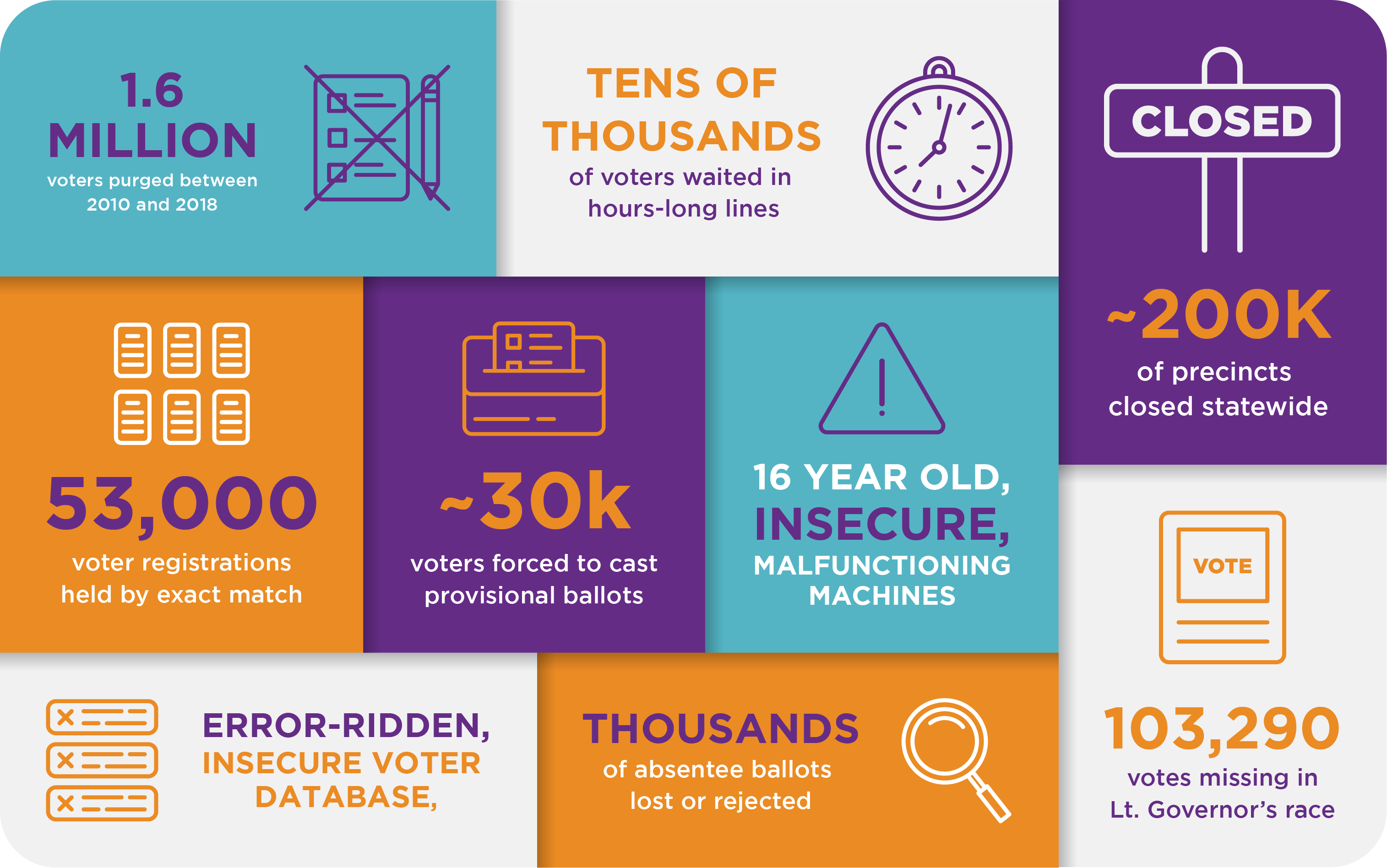
The Problem
Voting in the United States presents significant challenges, as citizens are faced with traditional processes that hinder access to what should be free democratic exercise. The current options, such as attending polling places or navigating through intricate mail-in voting procedures, contribute to an environment where individuals encounter obstacles such as poll watchers and long lines or failing to return ballots. Additionally, the existing vote-by-mail system relies on paper forms susceptible to errors, leading to the unfortunate outcome of spoiled ballots.
The Goal
How can we create a transparent and accessible platform for eligible voters?
We hoped to revolutionize the democratic exercise in the USA
by providing a seamless, secure, and user-friendly platform
that eliminates barriers associated with traditional voting methods.
Through an online voter interface, we hoped to enhance
accessibility, efficiency, and accuracy in the voting process,
thereby empowering citizens to exercise their democratic right
with ease and confidence. We hoped to address challenges
related to in-person voting, convoluted mail-in procedures,
poll watcher interference, long lines, and ballot spoilage,
ushering in a new era of inclusive and efficient voting for all eligible citizens.
IDEATION
Choices
Our team started with deciding on important considerations with the voting process. We asked: how could we shape the online voting process to be simple and accessible to all citizens?
| SUMMARIES | |
|---|---|
| Current Implementation |
The level of detail provided for initiatives on U.S. ballots can vary depending on the state/local election practices. In general, when voters receive their ballots, they are given the text of the proposed initiative, along with an explanation. These summaries are often long and are formatted as an unreadable long-form paragraph, without clear representation of what a YES versus NO vote is.
|
| Our Proposed Solution | There should be short summaries at an 8th-grade or even lower level available. We should make sure that citizens reading at the minimum comprehension level can understand the implications of the vote is. Especially for the proposition section, we should provide distinct reasoning behind a yes or no vote. |
| FACT-CHECKING | |
|---|---|
| Current Implementation | The process of fact-checking initiatives and candidate statements on U.S. ballots primarily falls on the responsibility of voters, advocacy groups, and the media. Candidate statements in voter information guides are often submitted by the candidates themselves or their campaigns. While there may be guidelines for the inclusion of statements, fact-checking by election officials is not always a standard practice. |
| Our Proposed Solution | Toggle the fact-checking feature when the user is setting up their experience; why not use the resources we have online to check the truth of such statements? We can make links to the candidate’s website always available via the candidate’s profile, where they can learn more about their stance - which may or may not have been fact checked. |
| INTERLOCK | |
|---|---|
| Current Implementation | Rules regarding the use of phones while voting or voting from home vary by state. In many states, the use of cell phones and electronic devices is prohibited within a certain distance of the voting stations. For example, in Texas, individuals are not allowed to use wireless communication devices within 100 feet of the voting stations, whereas in Connecticut, such laws do not exist. Voters can bring handwritten notes, or a sample ballot to refer to while vote. |
| Our Proposed Solution | There should be no forced interlock to check if users have read statements and/or ballot initiatives. There should also be no locked screen. Users should be able to seek external resources/sites as they wish while they vote. We also hope to provide shortened candidate priorities (ie. Through hashtags like #ForThis), add links to short form videos to watch a quick 30 second video about it to provide more context and understand what their vote for this person actually means. |
| PROTEST VOTES | |
|---|---|
| Current Implementation | Protest votes can take many different forms:
|
| Our Proposed Solution | On an online platform, “protest” votes are intentionally made by the user, such as writing in a name of a different “candidate”, or “None/Opt out”. They should be counted despite them not having a systematic advantage. |
| ORGANIZATION | |
|---|---|
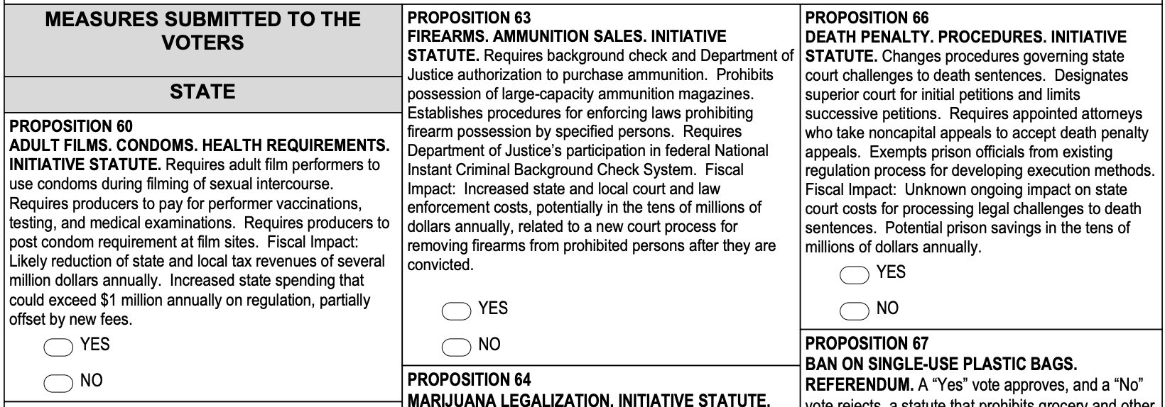
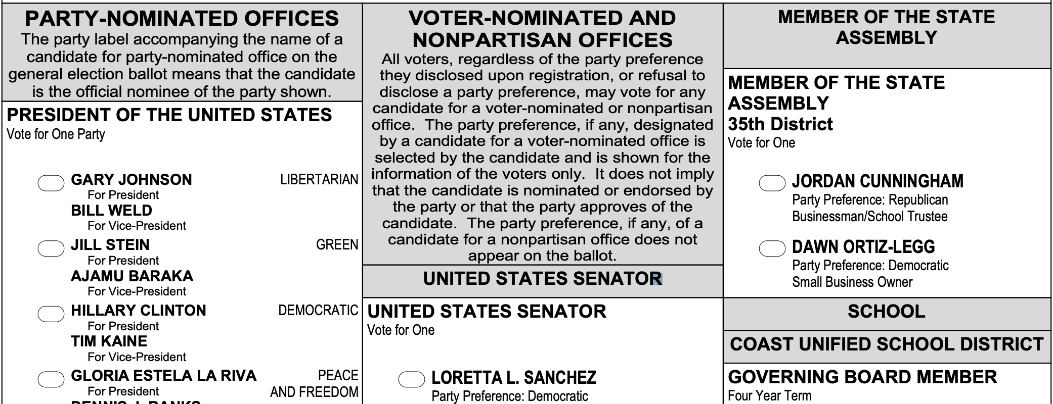
| Current Implementation | The order in which candidates appear on the ballots for general elections is typically determined by state election laws.
This can vary from state to state and within state, ranging from ordering alphabetically to party primacy.
Further, candidate selection is usually compacted to one to two pages, as seen below.
|
| Our Proposed Solution | Randomization within party and name is important as to not cause outcry or complaints from dis/advantage between candidates. Each candidate/initiative should appear on one page, rather than having different positions/initiatives smushed together on one page. This reduces overwhelm and distraction for the user. |
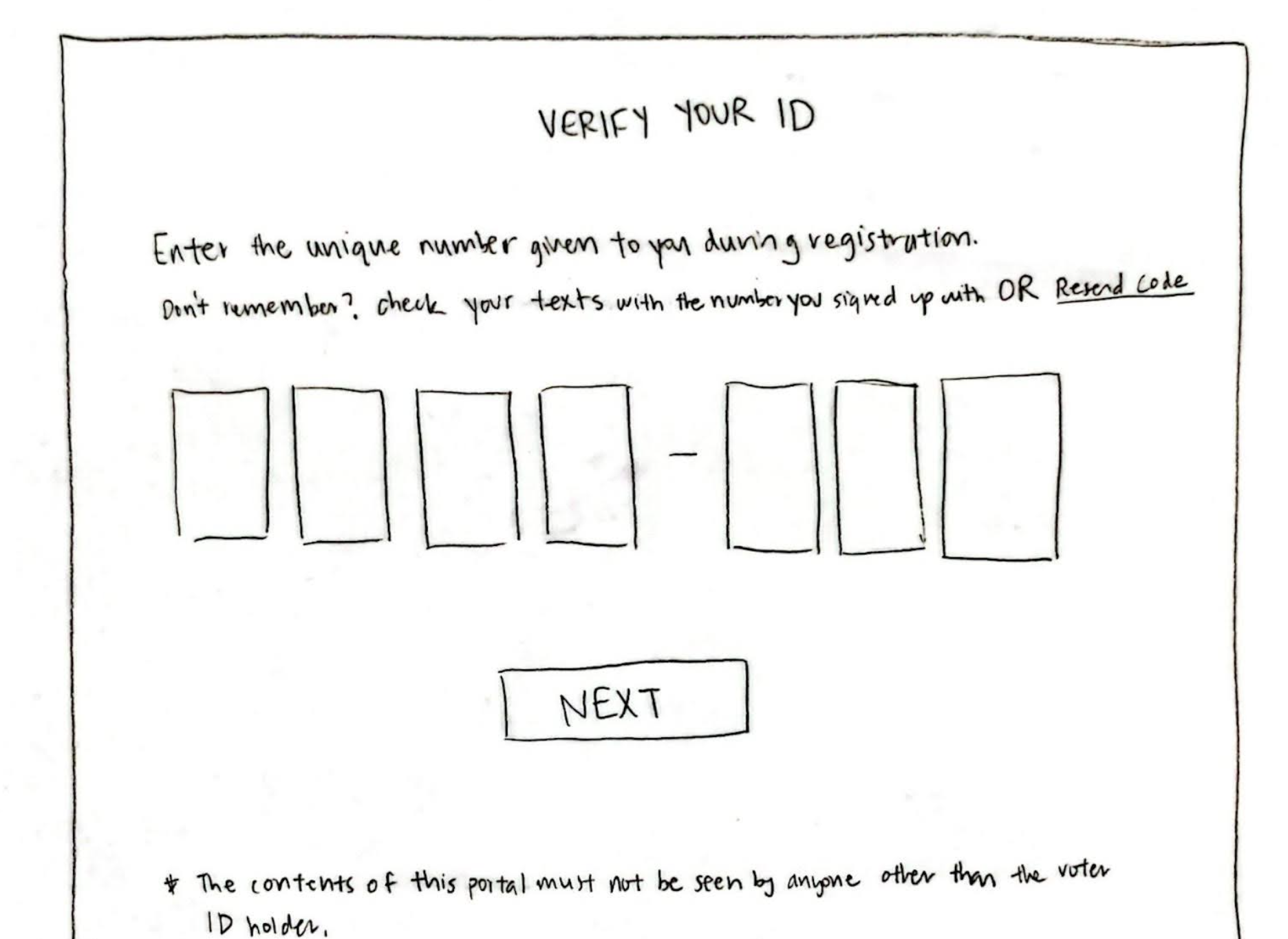
| IDENTIFICATION | |
|---|---|
| Current Implementation |
|
| Our Proposed Solution | There is a “new” implementation during voter registration (which is assumed to have happened by Voting Day) such that users obtain a unique temporary Identification Code after successfully registering to vote. This is only used for voting (and never used again). |
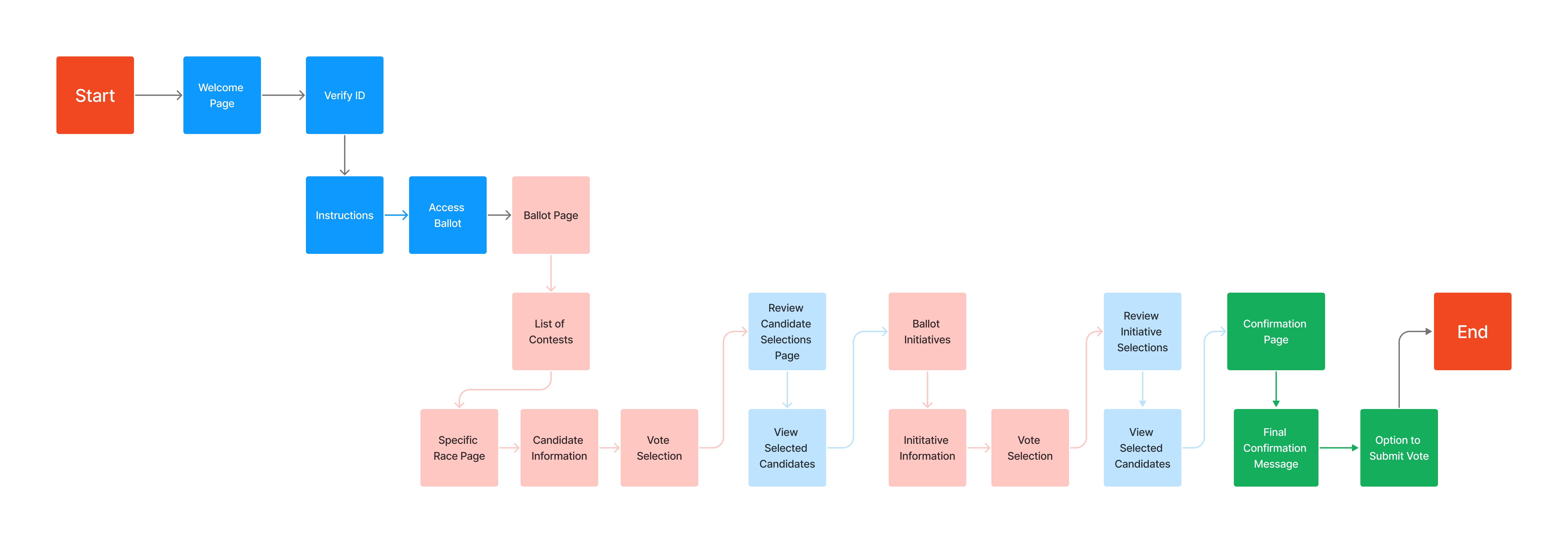
Flow Diagram
With our flow diagram, we decided to break the voting process into different sections: Candidate Selection, Candidate Review, Proposition Selection, Proposition Review, and finally, Ballot Review. By adding in these review processes in between selection, we hope to aid voters by ensuring that they ae given the opportunity to check their ballot as they go. This also helps to break down information and minimizes distraction from other selections/sections of the ballot.
Paper Prototype
Introduction Flow
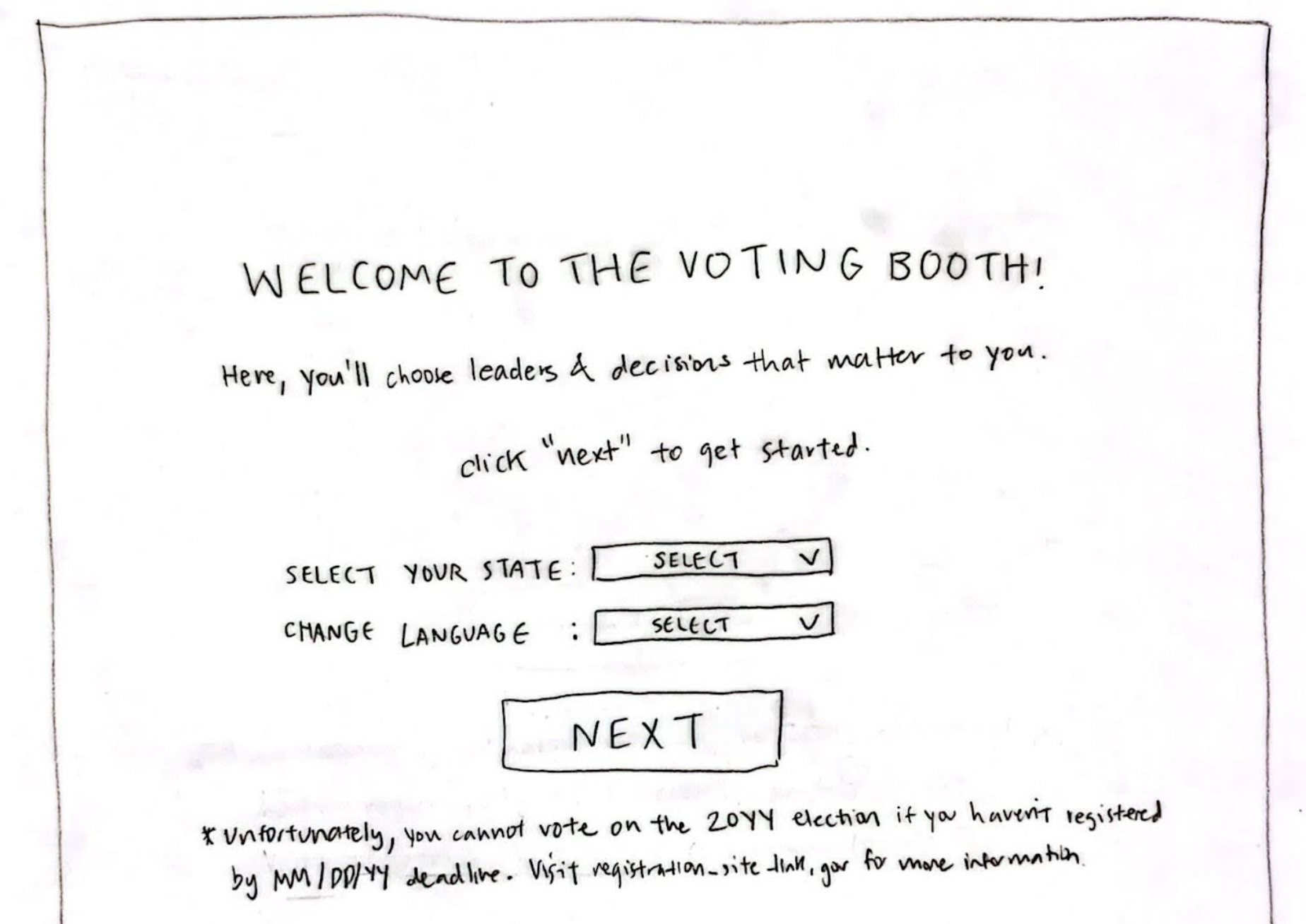
With our initial paper prototype design, we aimed to keep information to as close to the default page while keeping the design as reminiscent of a paper ballot as much as possible.
Candidate and Proposition Selection
Considering the large amount of information given to voters, we hoped that by implementing a design where users would have to click to learn more, whether through enlargening the Candidate View screen by clicking on a candidate, or toggling the expand button for propositions, that we could satisfy the need for any voter, whether or not they are looking for detailed information or looking to speed through the ballot. We also implemented an opt out option for users that may want to abstain from voting on a certain candidate or proposition.
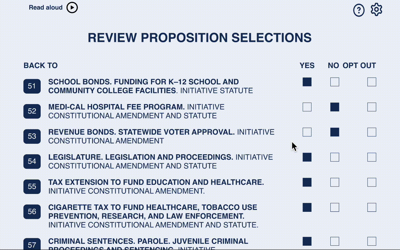
Review Selections
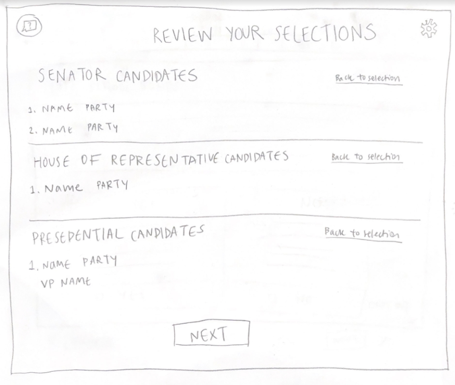
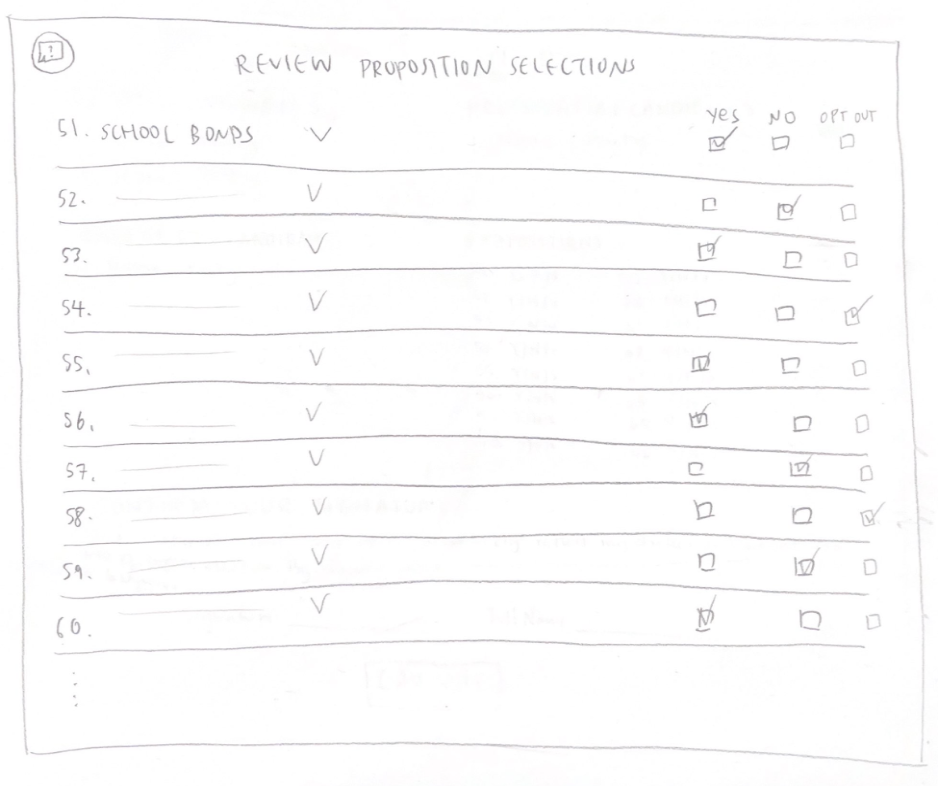
In terms of reviewing, we decided to not give users the permission to view candidate statements/proposition details outside of the selction process; We will only grant the opportunity to redirect to a specific candidate/proposition in the review section.
Paper Evaluation
From our paper prototype user tests, we found that users were able to follow the voting process with no assistance. Users could autonomously find and read candidate statements and cast their vote, as well as find, read, and vote for initiatives. However, improvements were needed to subside user painpoints, as shown below.
| Feature | Pain Point |
|---|---|
| Chatbot | All of our users failed to identify the chatbot on their own accord. We had to guide them to find it. |
| Candidate Selection | Users expressed that actions for selecting a candidate to view its details, versus selecting to cast a vote for a candidate were unclear. |
| Visual Design of Candidate Selection Page | Some users expressed that the amount of information shown on the candidate selection page upon load was a lot to see at once. They suggested that this should be reduced visually. Further, one user wondered how the page would be loaded since seeing a certain candidate’s statement/information shouldn't be the first thing that the user sees. |
Med-fi Prototype
From our paper prototype tests, we moved forward to implement a design that resolved user issues. Below are the most prominent changes for this stage's iteration.
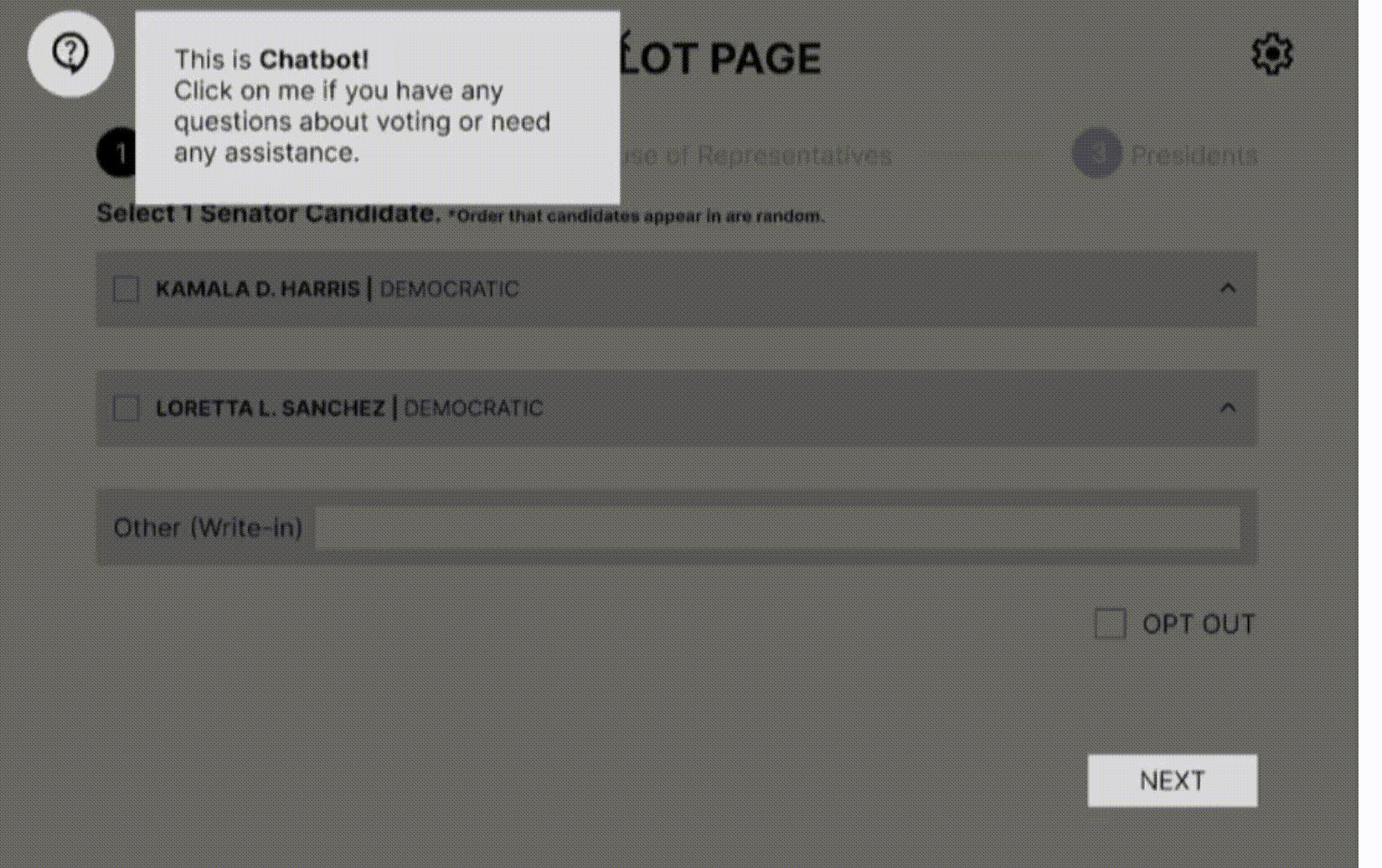
Introducing the Chatbot
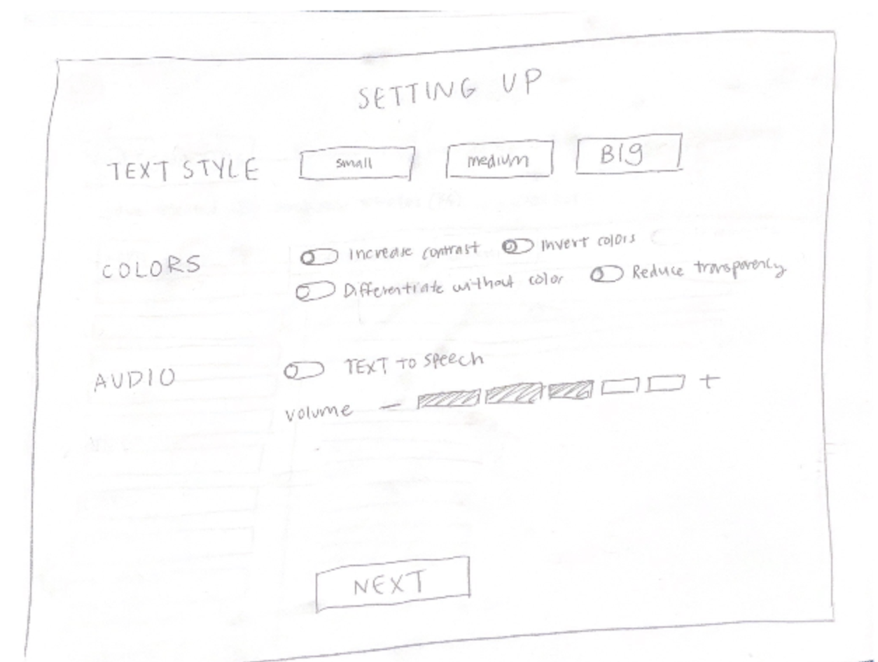
We decided to add an introductory flow after the ID verification process that shows the user where the chatbot and settings are located while they go through the voting process. This ensures that users who may need to change/toggle accessibility settings (such as the Text-to-Speech or Read Aloud option) can do so at any point of the voting process, as well as for any user seeking assistance on voting information to do so via the chatbot.
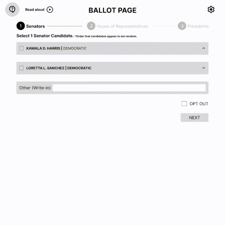
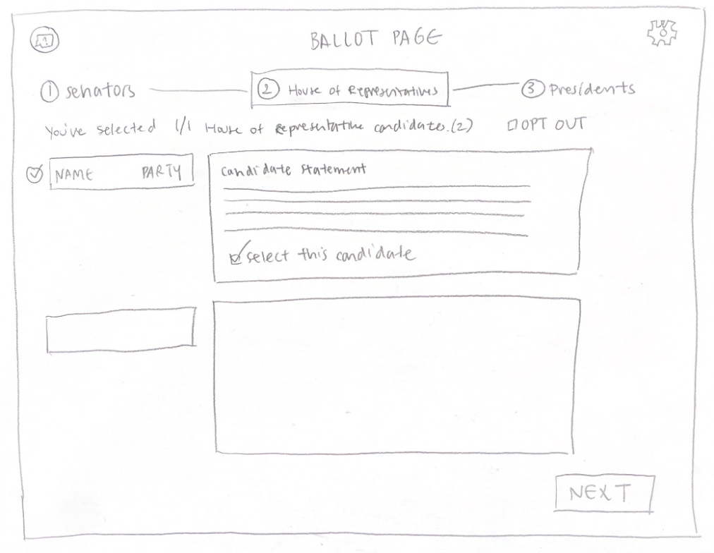
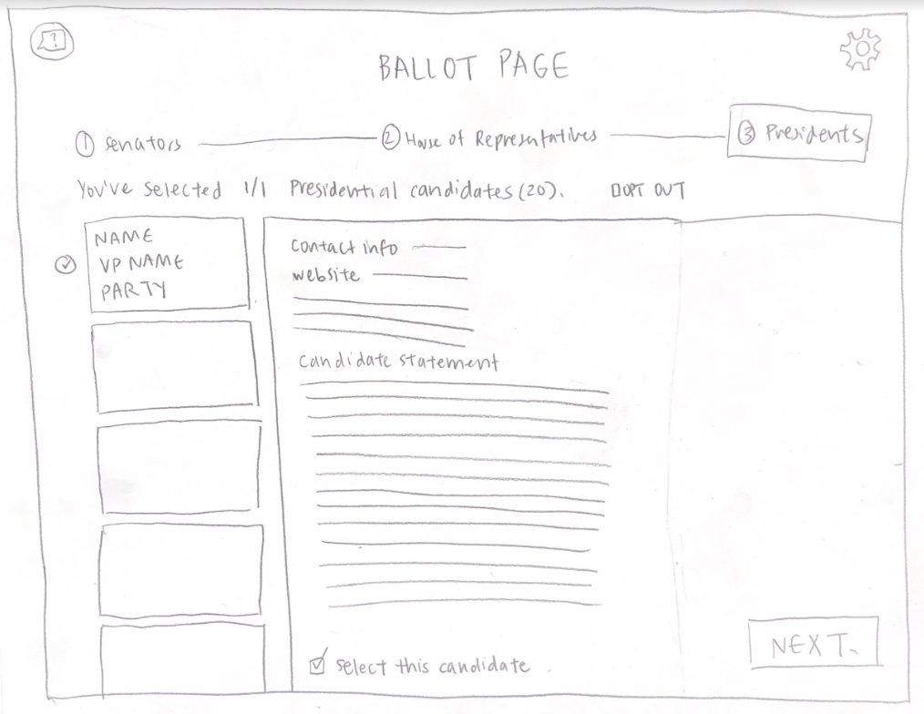
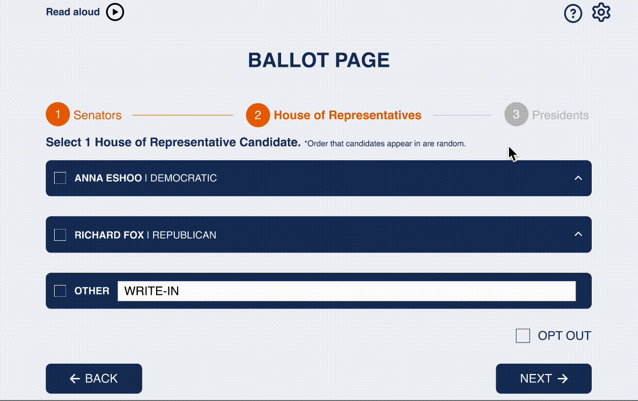
Toggle Candidate Information
To clear up user confusion with selecting a candidate to view or vote for and ease users' sudden overexposure to information at once, we decided to take on a new design. Much like a paper ballot, this new design simply shows candidates' name next to a checkbox for voters to mark their vote. Users are able to access more information about a candidate, such as their statement and website, by toggling the expanded view via the carrot at the end of the candidate's box. Or, for the user who doesn't care for statements and the like, can mark their vote and move on.
Med-Fi Evaluation
From our paper prototype user tests, we found that users had issues with:
| Feature | Pain Point |
|---|---|
| Navigating Back to Ballot Propositions | One user pointed out that the ballot propositions did not allow users to return to a specific initiative in the case that they would want to refresh the details behind the initiative. (Note that users are still able to change their vote on the Proposition review page.) |
| Voting Instructions | Though not as much as a "pain point", users agreed that including more direct language in voting instructions wouldn't hurt, seeing as this is an official interface and reflective as a government document of sorts; implementing blunt definitions and explanations would help with preventing confusion, as well. |
Final Design
Our biggest choice with our final design was adding color to our interface, We wanted maintain the simplicity of our previous iterations which is why we went with a "government" navy blue to emphasize trust and recognition as an official voting interface, contrasting it with an orange, its complement, to allow for high contrast between screen elements and text. This minimalistic aesthetic is intended to streamline the voting process, reducing visual clutter to minimize cognitive load.
The following are the features, some refurbished, others new, that encapsulate our last round of user testing and fulfill our ultimate goal of simplicity and accessibility in our online voting interface.
Section Introductions
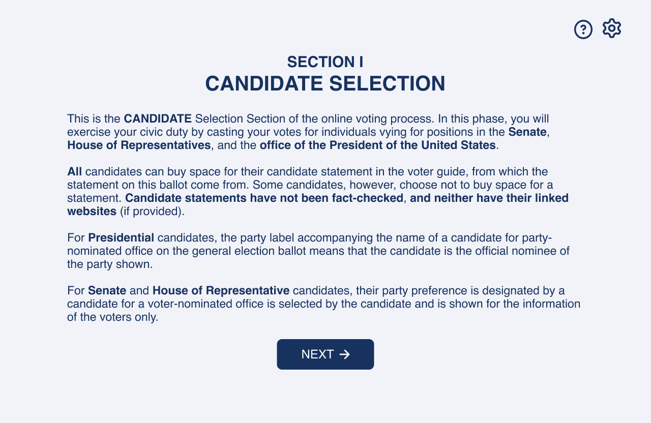
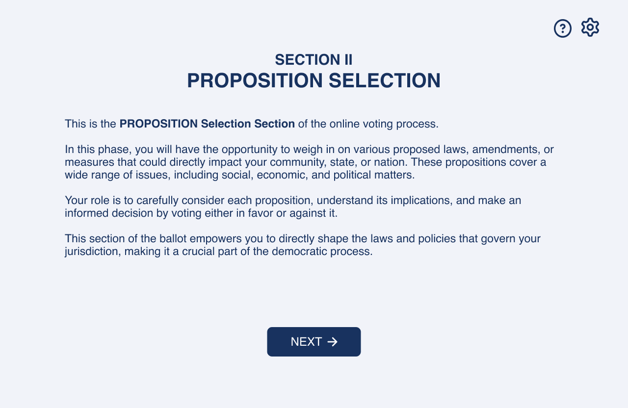
We decided to add introduction pages at the beginning of
each section for the sake of clarity. At the beginning of
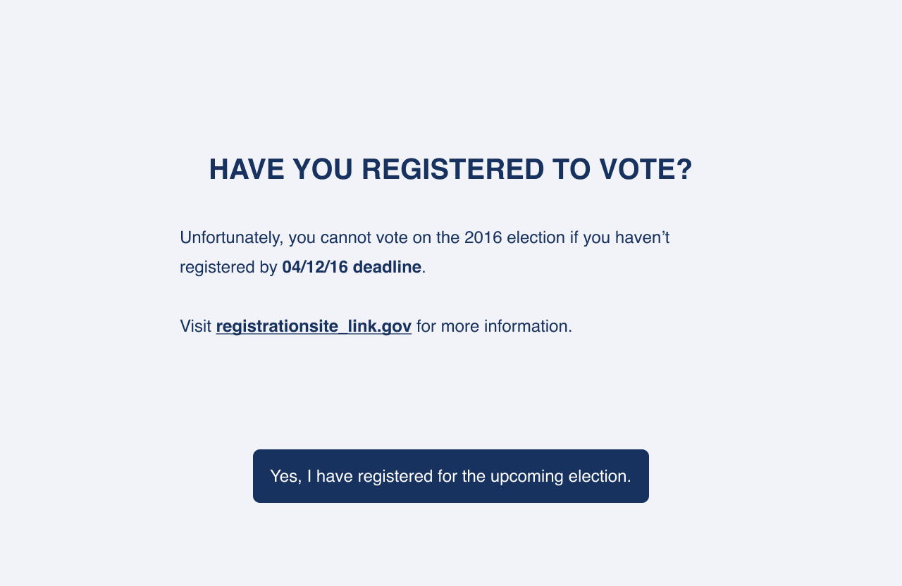
the flow, we add a "Did You Register to Vote?"
page to explain our theoretical online ID verification that
only works if the user has already registered to vote
in advance. As for the candidate and proposition pages,
we give short purposes of each section and provide crucial
information about candidate party affiliations, statements,
and propositions that would appear in the offical voter guide
or paper ballot.
Candidate Write-in
This feature was definitely the hardest to get going, but I challenged myself in learning how to prototype this interaction on Figma; and after a lot of arrows and character controls, I did it! Any of our group members' names can be inputted into the write-in (for tesitng purposes, of course.) To follow the affordances of the paper ballot, which allow write-ins, we implemented a type in write-in box for users, in the case that they wouldn't want to opt out or vote for a candidate.
Skipping/Returning Back to Propositions
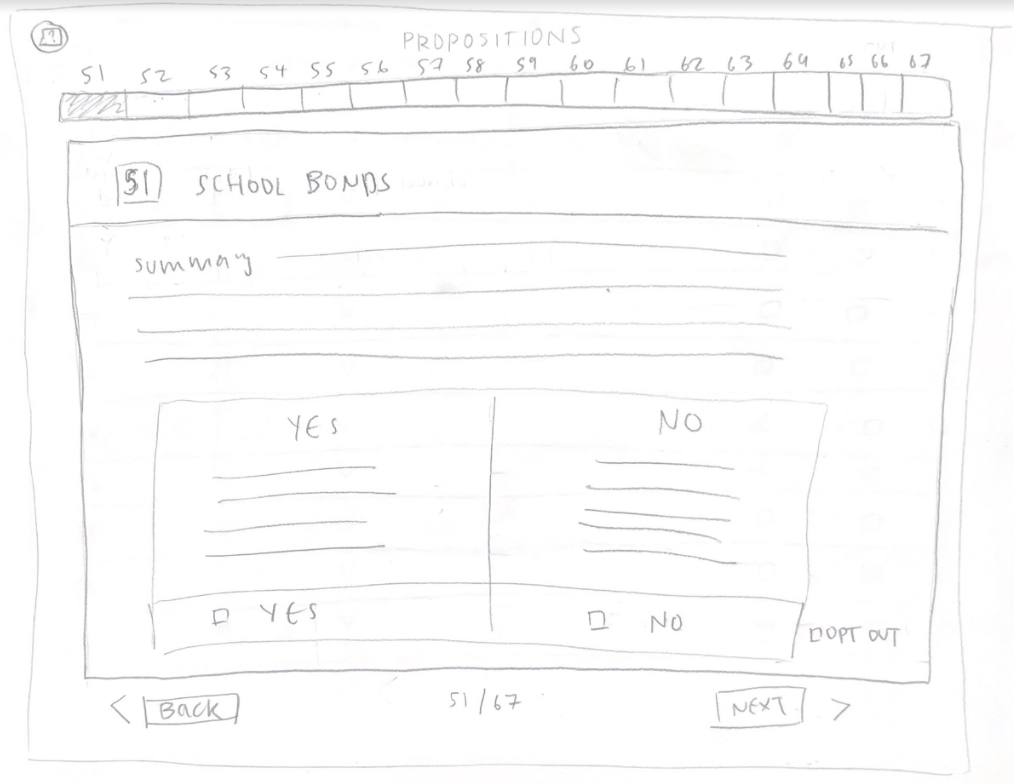
One observation from a user test was interesting: they attempted to go from one proposition to another by clicking on their desired proposition on the progress bar. I decided to implement this as a way for users to skip over propositions, but only in the case where they have already cast a vote up to the most recently submitted "Yes/No". For instance, if there last vote was for propositions 60, they can return to view any proposition before 60. This implementation is interesting as it ensures that users are reading what their vote truly implies.
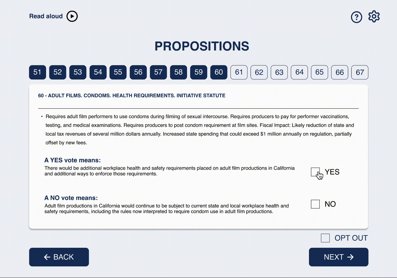
Reviewing Proposition Return
In response to the earlier user painpoint, we implemented a redirect back to the original proposition, where the user will be able refresh their knowledge on the details of a proposition once they reach review and beyond.
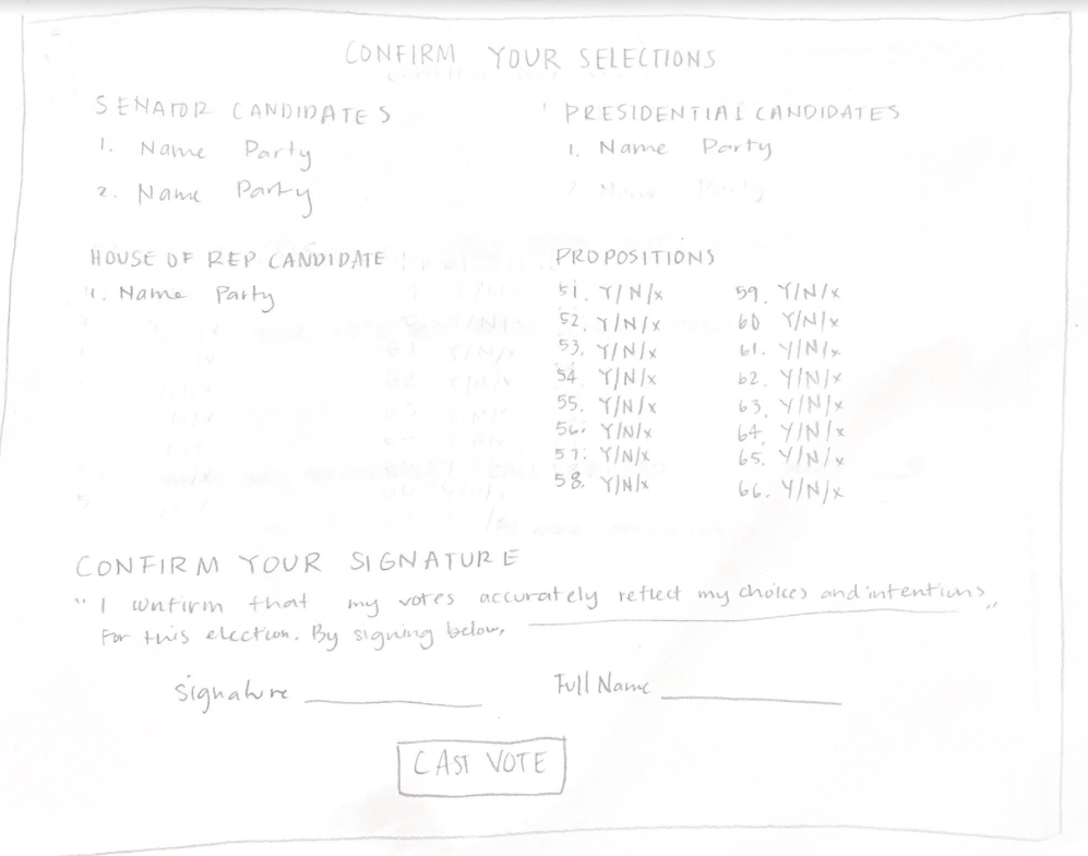
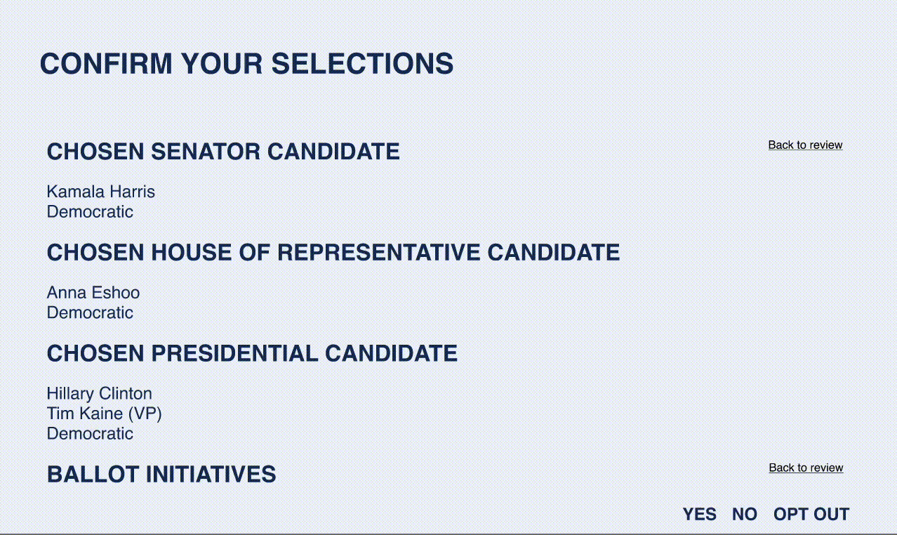
Submission and Confirmation
With submission, we added a warning pop-up that confirms whether a user is finished casting their vote or not. Giving users another chance to review their selections subtly reminds the user of the importance of their vote and ensures no mistakes (of the conscience, I guess, since there can't be an electronic spoiled ballot) on their ballot.
Reflections
Throughout the design process, I not only learned a lot about how to configure the different features on Figma such as with components and auto-layout, but also how to design in a way that emphasizes accessibility. I also learned about the many very intricate considerations when it comes to making an interface with such legal implications, while making it to appeal and be accessible to a very varied audience. Most of our group conversations centered around how to make this website safe and secure and accessible to as many as possible, without being politically illogical or unrealistic.
Overall, our interface succeeds in our goal of accessibility and simplicity. It allows for a personalized accessibility settings, which helps people with visual impairments, different familiarities to the voting system, and languages, which isn't as easy to implement with in-person voting. We allow people to access outside resources to guide their decision while voting, potentially increasing the number of people who vote from home. Lastly, the chatbot allows for personal help throughout the whole voting process, allowing voters to have accurate information easily available, and vote conscientiously.
Though our design was not cyclic, this was intentional as we aimed to alott users the same privileges that in-person voters have out of fairness. We attempted to mediate this by giving users options to go back and review voting decisions in between sections.
I had a great time working on this project, and it was my favorite of the semester. I thank my team for a great 4 weeks working together, as well as my Professor Dave Miller, and TA, Cass Burns for their guidance through this process.
Feel free to view the final and med-fi prototypes here.